This website is about many forms of graphic art.
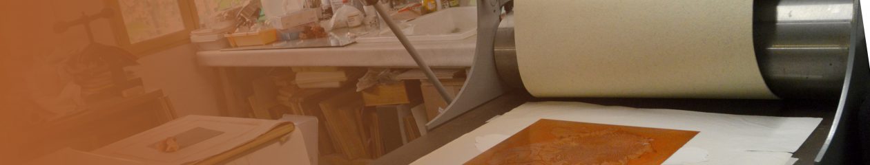
Explore the menu to find out about creating woodcut prints, made mainly along the traditional Japanese style called “Moku Hanga” with some modifications, as well as western style woodblock prints. The steps are illustrated in various ways and will make more sense if you decide to make a print yourself. The photos, text and explanations show how to make such a Moku Hanga woodcut.
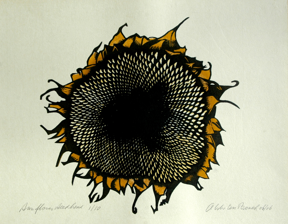
You will find information about Linocut prints and prints made by combining linoleum and plywood blocks. In addition, prints made with the drypoint technique and etchings from copper or zinc plate using various techniques. Finally there is a page about wood engraving.
The two Facebook buttons will take you to public pages relating to my art work or my woodwork and carpentry. You don’t have to be a member of Facebook to view those pages and you won’t be bothered by unwanted content. The pages are just like a blog.
All images are strictly copyright © to ACW ten Broek

The carpenters workshop on the plantation was one of my favourite places to hang out when I was a child.
Yusouf was the carpenter, always busy making the many pieces of equipment needed for work in the field or the factory. He showed me how he did things and we would swap the Dutch and Malay names for all the tools he used. It was just great to sit there between the shavings and wood curls and enjoy the smell of it.
In fact, a lot of the tables I made are based on the design of the beds baleh baleh he made for the workers. That’s what launched me into woodwork.
Photography has always been a big part of my life. As a teenager I would take photo’s at school parties and the occasional wedding celebration and even a local football team’s official photo. This to finance the next packet of photo paper, film, chemicals or equipment.
Edouard Jean Steichen, Alfred Eisenstaedt, Ansel Adams, Robert Capa, Henri Cartier-Breson, to name just a few, were my heroes and I would drink in their images. That’s why I still have a preference for black and white – for its expressiveness, the separation of tones and its contrast.
All images are strictly copyright © to ACW ten Broek

Woodcuts
wouter@acwwoodcuts.com
42 Rue Grand'Rue
11240 Belvèze du Razès
France +33 (0)4 30 07 30 80